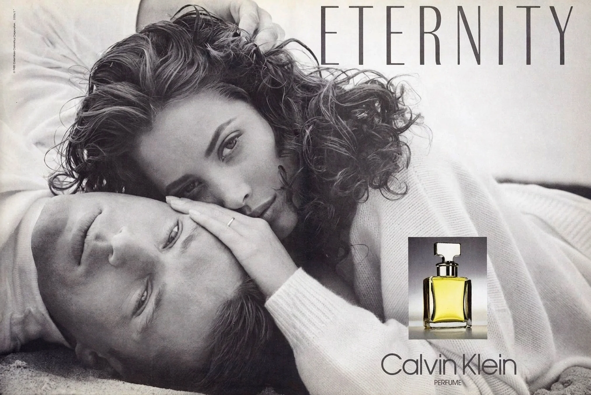
Skip to content

Plutonic Rainbows

Half of One Per Cent

The click was always a recoil. The Zip drive's heads would extract themselves from the cartridge, retract into the body of the drive, then return, then extract again, in a small mechanical loop that produced the characteristic metallic clack roughly twice a second. Each click was the drive trying to reset its head positioning after failing to read whatever it had just been asked to find. From outside the case it sounded vaguely like a bird trapped in a wall.

Iomega launched the Zip drive at COMDEX in 1994 and shipped it the following year. A hundred megabytes for two hundred dollars, in a cartridge slightly thicker than a 3.5-inch floppy, at a moment when the standard floppy still topped out at 1.44 MB. For three or four years it was the obvious answer to the question of how to move a graphic-design project, an undergraduate thesis, or a corporate quarterly between machines. The drives appeared in offices, in studios, in bedrooms running early DTP software. Then the clicking started.

In January 1998 the phrase "click of death" appeared in print, attached to Iomega's drives, and by September that year a class action had been filed in Delaware under the state's Consumer Fraud Act. Iomega's public response was a number: fewer than half of one per cent of users were affected. The figure was repeated in interviews, on the company's website, in the boilerplate that Macworld used when it covered the dispute. The implication was containment.

What the number left out was the contagion. A Zip cartridge that had been written to by a damaged drive carried the misalignment forward, in the form of corrupted servo data that the next clean drive would then attempt to follow. The clean drive would mis-track. The miscalibration would propagate. A single sick unit could pass the failure to a chain of replacements, which is why people in the late 1990s began keeping their healthy drives away from disks of unknown provenance the way librarians keep moths away from textile collections. Steve Gibson at GRC kept a public FAQ documenting the mechanism, and the term spread far enough that within a few years it had stopped meaning Zip drives specifically and started meaning any disk failure that announced itself audibly.

The lawsuit eventually settled around a packaging disclaimer. Sales fell as CD-R undercut the cost-per-megabyte. By 2003 Iomega had stopped selling Zips in any meaningful quantity. The company tried a CD-burner brand using the Zip name and a tiny sub-floppy called Clik!, neither survived. PC World later listed the Zip drive as both the fifteenth worst technology product of all time and, in a different list, the twenty-third best, which is the only honest summary anyone produced.

The strange afterlife is in aviation. Jeppesen distributed navigation database updates on Zip disks into 2014. Universal Avionics took TAWS uploads from them at the same date. Pilots in regional fleets were carrying 100 MB cartridges into cockpits twenty years after the click of death entered print, because the certification cost of changing a flight-management input is high enough to outlast a generation of consumer storage.

The haunting, though, sits with the people who lost a project to one. They learned, before their twenties were out, that physical removable media could betray you silently, and could spread the betrayal to whatever you tried to use as a backup. A whole cohort now treats anything that is not duplicated to a second cloud as already lost. The cloud-first reflex has many causes. One of them clicks twice a second, in a beige plastic case, somewhere in the second half of the 1990s.

Sources:

Python Jackets, Ostrich Jeans

When fashion writes the Hermès story now, the modern chapter opens in 1997. Martin Margiela arrives, the cigarette shoulder hangs in a museum somewhere, the orange-and-white archive photographs against beige walls, quiet luxury becomes a phrase the resale market can charge for. Everything before that is flattened into "the saddlery years" and a Birkin anecdote on a Paris-London flight in 1984.

It is a tidy version of events, and it leaves out the man who actually ran the ready-to-wear for most of the 1980s and into the 1990s. Eric Bergère was hired by Jean-Louis Dumas in the early eighties, on the same brief Margiela would later inherit: modernise the apparel without scaring the saddlery. Bergère worked alongside Bernard Sanz. The pair did not produce a quiet, traceless Hermès. They produced python motorcycle jackets and ostrich-skin jeans, which Women's Wear Daily, in a description I keep coming back to, called "a snazzier version of what Hermès has been all along."

There is a Getty image from the Fall 1985 runway, slightly underexposed in that mid-eighties magazine way, where you can see what they were actually doing. Hermès was not behaving like Hermès. It was behaving like a Milan brand with a leather budget and a saddler's hand. The python and the ostrich were not novelty pieces, they were the argument: the house would treat exotic skin the way it treated calf, as a workable material, not as a shrine. You could put it through a sewing machine and call it a jacket, and the jacket could be slung over the back of a chair like any other.

The numbers underneath this are easy to miss. When Dumas took the company in 1978, annual sales were around fifty million dollars. By 1990 they were four hundred and sixty million. That is the period Bergère was designing through. The Birkin went on sale in 1984 and the Kelly stayed where it was, but neither of those bags can carry a near-tenfold sales jump on their own. Something else was working. The ready-to-wear was working.

What I think happened is that Margiela's reputation absorbed the whole story afterwards. He arrived as a celebrity-resistant deconstructionist at exactly the moment the rest of Paris was hiring superstars (Galliano at Dior, McQueen at Givenchy, Tom Ford taking Gucci into different territory entirely), and the press needed Hermès to fit the narrative. Margiela became the designer who modernised Hermès. The designer who had already modernised Hermès once, fifteen years earlier, became a Getty caption.

Bergère is still working. There is an Instagram post from a recent Arles vintage pop-up dated 09–14 February, "Eric Bergere Paris Vintage 1995/2001 Arles rue des Suisses," which is the sort of footnote that tells you the man kept a studio and a client list well after the official Hermès chapter closed. Whether the resale market eventually catches up to the work, the way it has caught up to Margiela's tenure, is another question. Resale follows narrative, and the narrative is set.

Sometimes a designer is the one the brand remembers. Sometimes the designer is the one the brand needed in order to become the thing the next designer got remembered for. The python jackets did the unglamorous version of that work, and the work did not get a name on it.

Sources:

At the Third Stroke

Twelve million people a year still dial 123. They are paying thirty-odd pence for a courtesy that every device in their pocket performs for free, with greater accuracy, without billing them, and without the small ritual of holding a handset to the ear. Yet the calls keep coming. They spike on Remembrance Day. They spike on New Year's Eve. They spike on the two Sundays a year when the clocks change, as if a watch needs absolution from a more authoritative source before it can be trusted again.

The British speaking clock launched on the 24th of July 1936. Its first voice was a London telephonist called Ethel Jane Cain, who won a General Post Office competition and ten guineas for the job. The original machine was the size of a small room, all motors and glass discs and photocells and valves, her voice etched optically onto the glass like a film soundtrack. To reach her you dialled TIM, which spelled itself as 846 on the alphabetical Director-system dials of London, Birmingham, Edinburgh, Glasgow, Liverpool and Manchester. Other parts of the country dialled 952, then 80, then 8081, and only in the early 1990s was the number flattened to 123 everywhere.

Cain was followed by Pat Simmons in 1963, then Brian Cobby in 1985 (the same Brian Cobby who counted in the Thunderbirds opening, which is the kind of fact that sounds invented), then Sara Mendes da Costa in 2007. Four voices in ninety years. Each one is still out there, archived on retired machines at the British Horological Institute in Nottinghamshire, the way a body is preserved at a state funeral that nobody attends.

What I find strange is not that the service exists. Public infrastructure outlasts its purpose all the time. The strange thing is that anyone is still using it. The phone in my hand keeps time to within milliseconds of an atomic clock. Big Ben itself is now synchronised to BT's service, which means the speaking clock and Big Ben are two outputs of the same hidden reference, performing the same fact in different theatres. The building tells one audience. The voice tells another.

I think part of the answer is that a digital readout never asks anything of you. It is just there, glanced at, gone. Dialling 123 is a small commitment. You decide the time matters enough to ring for it, you wait through the preamble, you listen for three beeps and align your watch to the third one. That ritual produces a different relationship to the second than a screen ever does. Younger people mostly do not know what 123 is for. They will glance at a phone and laugh, in the way people laugh at the inexplicable. The laugh is fine. It does not change the calls.

There is something specific about the word stroke as well. The clock does not say tone. It says stroke, which is the word a grandfather clock makes when it announces an hour, the word a public bell uses when the village still has one. The speaking clock kept the vocabulary of the church clock and the parlour mantel, and ported them into the copper wires of a telephone exchange in 1936, and from there into BT's millisecond-accurate reference oscillator in 2026. The technology has been replaced four times. The word has not.

That is the part I keep turning over. We have a service that does nothing a wristwatch cannot do. It charges thirty-one pence a call. It is voiced by a woman in Brighton who recorded her lines in 2007. And tomorrow morning, when the clocks have been changed an hour or so before anyone gets up, twelve million people across a year will pick up landlines they barely use for anything else, and listen politely until the third beep, and put the phone down satisfied. The line they rang is older than nearly all of them. The voice on it is going nowhere.

Sources:

Cheaper Hardware Won

For most of the early 1980s, if you wanted to run serious Lisp, you bought a machine designed to run nothing else. Symbolics in Cambridge, Lisp Machines Inc. with its CADR-derived workstations, Xerox with the Dandelion and Daybreak, Texas Instruments with the Explorer. Each box was a small architectural argument: stack hardware, tagged memory, a microcoded instruction set tuned to the cost profile of a language with garbage collection and dynamic typing. The machines ran the Genera environment or its cousins, which many people who used them still describe as the most coherent development experience they ever had. A CADR sold for around fifty thousand dollars, an LM-2 closer to seventy, in the money of the time.

The business case held as long as the alternative was a conventional minicomputer struggling to execute the same code through a software interpreter. By 1987 that case was gone. Sun's workstations, particularly the Sun-3 line, were running compiled Common Lisp from Lucid and Franz on commodity Motorola silicon at prices a research lab could put on a regular procurement form. An Apple Mac II with an MicroExplorer board sat in the same office. The premium for going specialist had become a tax, not an investment.

What turned a slow erosion into a market collapse was DARPA. The Strategic Computing Initiative, launched in 1983, had been the quiet backbone of the Lisp machine business. Many Symbolics customers were ultimately spending federal AI grant money. When funding for the program contracted in 1987 as the Reagan-era defence build-up cooled, that procurement channel narrowed in the same fiscal year that commercial buyers were already pulling back. Symbolics's revenue did not decline gracefully; it fell off a cliff.

Underneath the hardware story was a software story everyone in the industry could already feel. The expert systems boom that had justified the optimism, XCON at DEC, the Authorizer's Assistant on American Express phones, MYCIN in research, was running into the qualification problem. Rules did not generalise. Updates required the original knowledge engineer. Maintenance costs in year three or four often exceeded the system's payback. By 1988 corporate buyers had concluded that what they had been sold as artificial intelligence was, mostly, a brittle and expensive form of structured programming.

LMI went bankrupt before its K-machine reached customers. Symbolics restructured repeatedly through the early 1990s and emerged as a software company selling Open Genera into a niche that has never quite closed. Xerox quietly folded the AI workstation work back into the rest of PARC. The hackers dispersed into Common Lisp standardisation, into the early internet companies, into academia. The hardware did not die for technical reasons. It died because the market discovered it could buy ninety percent of the experience for ten percent of the money, and ninety percent was enough.

The lesson was not new even in 1987. It was the same lesson Pierce's panel had delivered about machine translation twenty-one years earlier: a field can be made to look unviable simply by removing the subsidy that was holding it up. The funders left, and the rest followed. Anyone working on AI infrastructure in 2026 should at least know the shape of the room they are standing in.

Sources:

Compute Goes to Coding

OpenAI is shutting Sora down. The web app and the iOS app close on April 26, 2026, the API follows on September 24, and after that user content gets permanently deleted. This is not the quiet sunset of a side project. Sora was the public face of OpenAI's creative play, the model Disney signed a partnership around, the demo that anchored earnings narratives whenever someone asked what came after text.

OpenAI's stated reason in the help-centre notice is simply that it wants to funnel compute toward coding tools and enterprise customers. Translating: the H100s and B200s that have been rendering sixty-second clips of impossibly detailed dolphins are being pulled off that workload and assigned to whatever the consolidated ChatGPT super-app needs next. The research itself continues, repositioned as a world-models programme aimed at "automating the physical economy", a phrase that does a lot of work to make a euthanasia look like a graduation.

Disney has terminated its partnership. That is the cleaner data point. Whatever the public renderings looked like, the studio with the most to gain from licensed generative video has decided the technology is not where it needs to be, or not on terms it can sign. A studio walking away from a free pilot is louder than any benchmark.

I keep coming back to what this admits about the economics. For a while the standard story about generative video was that compute would get cheaper, models would get better, and at some inflection point the per-second cost of a Sora clip would slide under the per-second cost of a junior motion designer. That story is now visibly losing to a different one, in which coding agents and enterprise SaaS deliver more revenue per GPU-hour than entertainment ever will. OpenAI has done the arithmetic, and the arithmetic says video is a hobby it cannot afford while it is also paying Microsoft and burning through Stargate construction.

It is interesting to read this against Anthropic's announcement last week of nine creative-software connectors: Photoshop, Premiere, Ableton, Blender. Anthropic is not trying to be the studio. It is trying to be the assistant inside the studio that already exists. OpenAI built a studio and could not pay the electricity bill. The two strategies look like they were drawn from the same brief and answered with opposite philosophies, and right now Anthropic's answer is the one that scales without a Disney deal.

There is a familiar pattern here too, of OpenAI shipping things and watching them land softer than expected. Sora arrived with a consumer app whose novelty wore off in weeks, and the broader product never broke containment with general audiences. By the time other news cycles took the oxygen, the case for keeping the lights on was hard to make to a board counting GPU-hours.

What stays with me is the deletion clause. Users have until the cutoff to export their generations, after which OpenAI promises to remove the data from its servers. A whole archive of synthetic minutes, every prompt that was a hopeful sentence and every output that was a slightly wrong dream, gets unmade on a schedule. The compute moves on to write Python. The footage does not get a museum.

Sources:

Green Against Red

Oscar de la Renta's Fall/Winter 1991 show sits in a strange part of the decade, before minimalism had fully cleaned the room and after eighties excess had started to look self-conscious. You can feel that threshold in the footage. The clothes still believe in finish, in a proper entrance, in a hat that has no intention of apologising for being a hat. But the line is sharper than the word elegance usually implies.

TIME's retrospective note on the collection puts de la Renta's formula as French elegance, American ease, and Latin flair. Fair enough, though the phrase makes the clothes sound more polite than they are. The Fall/Winter 1991 show had tartan, military references, scarves, road-map motifs, and draping, all the things that can tip into decorative comfort if the designer lets them. Oscar mostly doesn't. He keeps the surfaces rich and the silhouettes composed, then lets colour do the less civilised work.

This green coat is the argument in its simplest form. The cut is almost severe: high collar, broad clean panels, double-breasted buttons placed low enough to make the torso feel elongated rather than boxed in. Then the colour arrives, not tasteful olive, not bottle green, but a flat, saturated green that behaves like stage lighting. Behind it, the red look passing out of focus turns the photograph into a colour field before it becomes a fashion image.

That is why the hat matters. Without it, the coat could drift into beautiful costume. With it, the look becomes architectural, a column with a face under the roofline. De la Renta was never a minimalist in the Helmut Lang sense, but here he understands the same lesson from the opposite direction: remove enough fuss and one decision starts to ring. The whole look works because it understands how much pressure one clear colour can carry.

The early nineties are easy to retell as a clean break: power dressing dies, deconstruction arrives, minimalism wins, everyone discovers greige. That version is tidy and mostly false. The season was messier than that. Valentino was still making continuity feel like a discipline, Claude Montana was trying to carry the shoulder into a new decade, Alaia was about to run Tati gingham through couture technique, and de la Renta was showing clothes that treated polish as a live position rather than a nostalgic one.

Watching the Fall 1991 runway now, what strikes me is not how dated it looks. Some of it does, of course. Almost everything from 1991 does if you stare at the styling long enough. What survives is the confidence of a designer who knew exactly where theatricality ended and authority began. The show gives you military lines without turning into uniform, scarves without souvenir softness, colour without coyness. It is grand, but not vague.

The green coat holds because it doesn't ask to be liked. It asks to be seen cleanly, against red, against black, against the version of 1991 that keeps trying to simplify itself after the fact.

Sources:

Cloying Was the Brief

For ten years before March 1995, Rei Kawakubo's reputation was fixed. Black, frayed, asymmetric, holes where holes don't belong. Hiroshima chic, the press called it, with the casualness of people who had not yet noticed the term was offensive. Then she sent models down a Paris runway in pink tulle, hoopskirts, Peter Pan collars, and pastel chiffon, and called the collection Sweeter Than Sweet.

Kawakubo herself was unusually plain about the intent. She told Vogue she wanted to express "extreme sweetness, a sweetness that is almost overpowering." Not a concession to the customer. Not a softening of her line. An experiment in what happens when you push prettiness past the point where it stays pretty.

The runway report from the time makes this clear once you read past the materials. There were capes and coats whose construction restrained the models' arms, hampering upper-body movement. The hoopskirts held the wearer at a fixed distance from anything nearby. What looked at first glance like a fairy tale was, on inspection, a series of garments that constrained the body inside them.

This is the part the photographs from the time tend to flatten. Irving Penn shot the finale looks for Vogue's October 1995 issue, and his lighting and pose direction made the dresses read as romantic and still. Stillness in Penn's frame was a compositional choice. Stillness in the original collection was structural, imposed by the clothes themselves.

I keep thinking about the relationship between this show and the 1997 collection that everyone remembers, the lumps-and-bumps "Body Meets Dress, Dress Meets Body" with the padded protrusions on the hips, shoulders, and back. Sweeter Than Sweet came two years earlier and worked the opposite way. Instead of adding bulges to the body, it built a sweet exterior and locked the body inside it. Both collections asked what a dress was for. The 1997 one is louder about the question. The 1995 one is, if you actually look, the trickier of the two.

The reception in 1995 was confused, and by Kawakubo standards that was a success. Critics who had spent a decade lecturing on deconstruction did not know whether to read a pink coat as betrayal or as another kind of provocation. Some thought she had finally given in. Some thought she was satirising the houses that had spent the decade copying her without understanding her. Both readings missed the point, which was simply that sweetness was a material she had not yet pushed to its limit, and now she was pushing it.

The collection didn't vanish. When Andrew Bolton curated Rei Kawakubo / Comme des Garçons: Art of the In-Between at the Met Costume Institute in 2017, Sweeter Than Sweet was one of the collections the show drew on to make its case about Kawakubo's career, organised by Bolton around nine "in-betweenness" dualities. The garments themselves continued to circulate. A pink two-dimensional coat from the collection sold at Piasa in Paris for around $7,600, which by archival CDG standards is the price of being in the canon.

The thing nobody really argues about, thirty years on, is whether the constraint was the joke or the work. The hoopskirts and the tulle did the obvious work. The capes that pinned the models' arms did the real work. Sweeter Than Sweet is one of the few cases in 90s fashion where you can see the designer conducting an experiment on the audience in real time, with every garment a measurement.

Sources:

Office 4.2 Decided

Susan Kare drew the first floppy disk save icon for the Macintosh in 1984, working in the same pixel-by-pixel kit that gave the machine its smiling computer and trash can. The disk she drew was the 3.5-inch Sony cartridge, introduced in 1981, which the Mac shipped with as its only mass storage. There was no hard drive option. Every save you performed on that machine literally involved the object on the screen. The icon and the act were the same thing.

What's strange is that the icon survived the act by about thirty years and shows no sign of stopping. The disk it depicts has not been manufactured in volume since 2011, when Sony ended production, and most people under twenty-five have never held one. Yet the same little square with the metal slider sits in the toolbar of every Microsoft Office application on the machine I'm typing this on. Word still uses it. Excel still uses it. PowerPoint still uses it. The shape persists as a kind of pictographic fossil, a sign whose referent has been quietly removed without anyone agreeing to retire the sign.

The standardisation moment, in case you wondered who exactly chose this for us, was Office 4.2 in 1993. Earlier suites had used floppy icons inconsistently, Word 2.0 had one, Excel 4.0 had one, Lotus 1-2-3 had two of them, but 4.2 was the first release where every application in the bundle put the same disk in the same place on the same toolbar. Microsoft's market share did the rest. Within five years the floppy was the universal visual shorthand for "save," and within ten the actual hardware was a curiosity.

This is the part that interests me. The icon was not a deliberate monument. Nobody at Microsoft in 1993 was thinking about preservation. They picked the floppy because it was the storage medium people understood, and people understood it because it was the storage medium they were using that morning. The longevity of the symbol is purely an accident of inertia, the way the QWERTY keyboard layout outlived the mechanical problem it was designed around, the way the railway gauge in most of the world is the width of a Roman cart axle.

The trace persists because nobody has the authority to replace it. Apple quietly stopped showing floppies in their interfaces years ago, leaning on autosave and the explicit verb. Google Docs has no save button at all because the document is being written into a server every keystroke. Modern web frameworks present cloud icons or simply the word save. But the floppy holds its position in the world's most installed productivity suite, propped up by muscle memory and the cost of retraining a billion users to recognise something else.

I think about this whenever someone tells me interfaces are purely functional. They are not. They are sedimentary. The world before the index left visible deposits in the present, and one of them is a 1.44 megabyte cartridge that nobody under thirty has ever fed into a drive. The cartridge was discontinued. The image of the cartridge was not.

The next generation will inherit the icon without the object, the way I inherited the phrase "dial a number" without ever turning a rotary wheel. At some point the floppy will become a purely abstract glyph, like a hieroglyph that has lost its phonetic value. We will keep clicking it because clicking it saves the file. The fact that the picture is a picture of something will fade, and the picture will simply mean save, as if it had always meant that.

Sources:

Six Reels Per Visit

The British Library's current guidance for its Newsroom still says you can request up to six consecutive microfilm reels per visit. The number is not arbitrary, it is what a single staffed afternoon can be expected to handle, what a desk can hold, what a researcher can plausibly wind through before the room closes. A search, in those terms, was bounded by furniture and daylight. You did not run a query. You booked a shift.

The municipal version of the same machine, stationed in Banbury or Lancaster or one of a thousand provincial reference libraries, sat in a corner most patrons walked past. The fiche or reel for the local paper, say the Banbury Citizen from July 1989 onward, or the Oxford Courier between 1987 and 2006, lived in a locked cabinet and was issued one at a time. The reader itself was a bench unit with a bright lamp behind a glass plate, a magnifying optic, and a wheel you turned by hand to scroll the film under the lens. The image came up reversed and shimmering and much larger than it had any right to be, and the lamp gave off a faint warmth that the rest of the library lacked.

What the machine did, mechanically, was simple. What it did phenomenologically was take the past, miniaturised onto plastic film a generation earlier by someone whose job was to anticipate the rot of newsprint, and project it back into a small lit rectangle in front of one person at a time. The reader was a seance with a frame counter. You asked for an article you half remembered, the librarian retrieved a reel, you sat alone in the corner the library had set aside for this purpose, and you wound through the days of a town's recorded life until you found the paragraph you came for or did not.

The not-finding mattered more than people who only used the internet remember. If the reel was missing, scratched, or the frame had been cut out by a previous reader, you had no second move. There was no neighbouring database, no adjacent search term, no fallback URL. Your trip was the trip. You went home without the thing, and the thing remained, in a literal sense, unreachable.

This is the texture the present has lost cleanly. A failed search now is a prompt to rephrase. A failed search at the microfiche reader was an outcome. Whatever you did not find on that reel, between those dates, in that paper, was simply not yours that week. Some of those gaps closed later, when a reader returned with a rumour, a date, a different paper. Many did not.

The corner itself was usually unpleasant, and that was not incidental. The machine had been inherited from an older preservation logic that did not have to ingratiate itself with anyone. The fiche existed to outlast the paper. The reader existed to read the fiche. The patron existed to be patient.

I think about this when people describe library closures as a loss of community space, which they obviously are, but also as a loss of the specific room in which not-finding still meant something. The world before the index was not only geographically bounded. It was bounded by the mechanical ceiling of how fast one person could turn a wheel.

The microfiche reader is mostly gone now from the high-street branches. It survives in the larger reference collections, sometimes upgraded to a digital scanner with no print or email function, which is its own joke. Six reels per visit, still, because the procedure was never really about the reels.

Sources:

Claude Moves Into the Studio

Anthropic announced nine new connectors today that wire Claude directly into the software professional creatives actually use. The list reads like the contents of a working freelancer's dock: Adobe Creative Cloud (Photoshop, Premiere, Express), Affinity, Blender, Ableton, Autodesk, Splice and several others. The announcement on Anthropic's site frames it as an extension of Claude Design from earlier in the month, but the ambition is broader. This is the company trying to sit inside the apps where the work happens, not on a separate tab where the work gets summarised.

The technical mechanism is MCP, the Model Context Protocol Anthropic introduced last year and which has since become the de facto standard for letting an LLM read from and write to outside tools. Each connector is a small server that translates Claude's requests into the host app's native API. The Blender bridge, for example, exposes Blender's Python API as natural language: ask Claude to instance a hundred copies of an object along a curve with random rotation, and it does the equivalent bpy calls. The Ableton connector is more modest, it indexes the official documentation and answers questions, rather than opening a session and arming a track. The Adobe one sits somewhere in between, able to pull assets from Creative Cloud into Claude's context and trigger actions back inside Photoshop and Premiere.

It is worth being clear about what this is and what it is not. None of these connectors replace the practitioner. The Verge notes that Anthropic itself is careful in the announcement copy: "Claude can't replace taste or imagination." The pitch is repetitive manual labour. Renaming layers, batch-tagging clips, building out a hundred variations of a packaging mock, sourcing a sample pack that fits a brief, generating the boring scaffolding around the interesting decisions. The interesting decisions remain a human problem. The argument is that if the boring scaffolding gets cheaper, the interesting decisions get more time.

Whether that argument survives contact with reality depends on which side of a creative team you sit. Senior people who already delegate the scaffolding to juniors will probably love this. The juniors whose job was the scaffolding will not. The historical pattern when tooling absorbs entry-level tasks is not that the work disappears, it is that the bottom rung of the ladder gets sawn off and the people who were supposed to climb it go elsewhere. The studios that are healthiest in five years will be the ones that figured out how to keep training people through the gap.

The strategic read is that Anthropic is now doing to the creative suite what it already did to coding and is trying to do inside the federal government. Pick a high-value professional vertical, ship a connector that makes Claude useful from inside the workflow, accumulate the kind of sticky usage that survives the next model swap. OpenAI, as the Atlantic noted this morning in a separate piece, is reliably about three months behind on this playbook. The follow-on Codex-for-Photoshop announcement should land before August.

The thing I will be watching for is the long tail. Nine connectors on launch day is a press release. Ninety connectors in two years, maintained by a healthy third-party community using the MCP spec, is a platform. Anthropic has been quietly betting that MCP becomes the USB-C of agentic tooling. Today's launch is the loudest evidence so far that the bet is being placed at the application layer, not just the infrastructure layer.

Sources: